Knob to PNG
Drawing dial images for Max for Live devices with HTML Canvas
Table of Contents
There’s probably a billion different ways to draw the interface control known as the ‘dial’ or ‘knob’. But at a minimum, this virtual control must visually resemble its physical counterpart enough to make its operation obvious to the user. Who hasn’t turned a knob before?


Anatomy of a Dial
The dial we’re making is a simple, line–based affair that’ll be easy to draw in code and will more or less look at home in Ableton Live or a similarly styled app.
The shape of the dial is defined by the 45° wedge taken from its bottom border. This gap in the outer border visually orients the control and indicates its linear minimum / maximum value operation. The border element also serves as a state indicator through the use of color. Inside the indicator is the knob. This is a purely decorative element meant to reference the circular shape of real-life knobs. Attached to the knob is the needle. The needle indicates the position of the knob and also serves as an interactive target.
pictctrl vs. live.dial
If you’re making a Max for Live device that requires a dial control, you should use the built-in live.dial object. Its colors are customizable, it'll save you time and, most of all, the live.dial object will look and work like a native Live dial.
But, if you’re making a stand–alone MAX patch or just like the rich feel of artisanal dials, you’ll need to use the Max UI object pictctrl and create the required image assets for it.
What pictctrl Wants
The pictctrl object uses a single filmstrip–like image to represent all the states and steps of the control. Each individual state occupies a row in this image. That way you can specify active, inactive and disabled states (to name a few) in a single image. For this example, we’ll stick to just one default state for our dial so that our image is only one row tall. We’ll construct our pictctrl image by arranging all the individual frames of the default state side by side in a row, like so:
pictctrl image asset.pictctrl’s image dimensions will vary in size depending on the size of the template frame and how many frames you want it to have. So, for example, if your dial control is 50px wide by 50px tall and you have 128 frames, your pictctrl image will be 50px * 128 or 6400px wide. Common MIDI values range from 0-127 so 128 frames is a convenient number for mapping each dial frame to a unique data value.
pictctrl object.Knob Builder
Hand drawing every frame of your dial image in a program like Photoshop or Sketch will give you good results provided you’re willing to put in the time. But, if you want to speed things along, or if you just need to quickly make a Max dial control, the Knob Builder below was made for exactly that purpose. You can customize the dial’s size, wedge amount, colors and number of frames. Just save the final drawing that appears below the Builder to your computer and you’ve got the image asset required to build a simple pictctrl.
pictctrl object. 1800px wide 50px tall PNG. Ctrl + click or long-press to download.A pictctrl Example
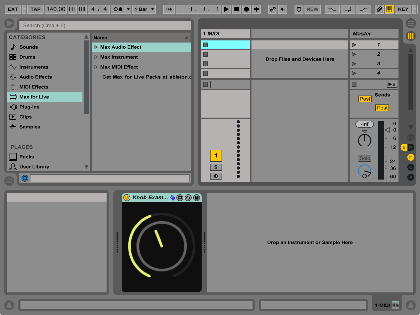
Now that we’ve got a frame–by–frame dial image, lets’s put it to use in a simple Max for Live device.
-
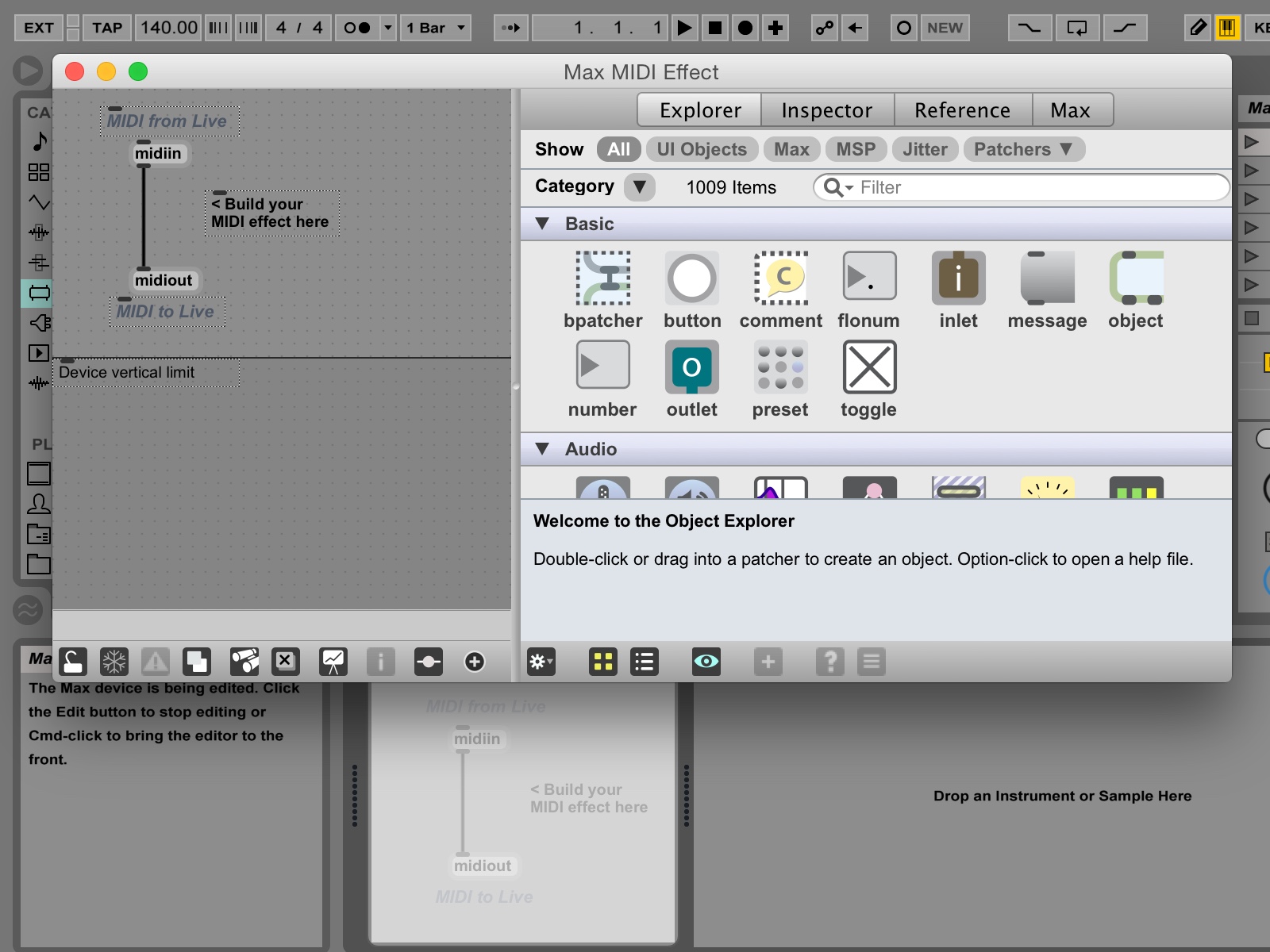
Start a new Live project and drag a new Max Midi Effect to an empty MIDI track. Click the Edit Button on the Max device to launch Max.

-
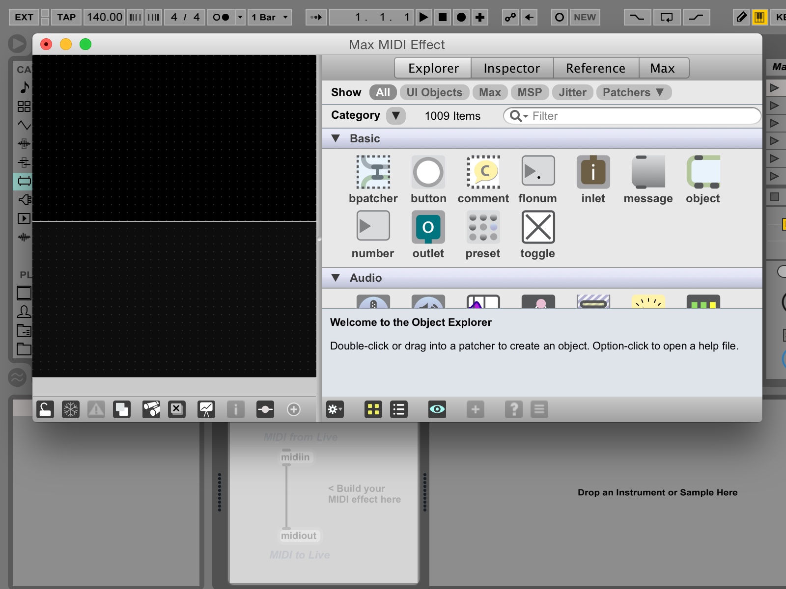
Select all and delete to clear out the default Max Midi Effect device. Open the Patcher Inspector and change the Background Color and Unlocked Background Color to black.
-
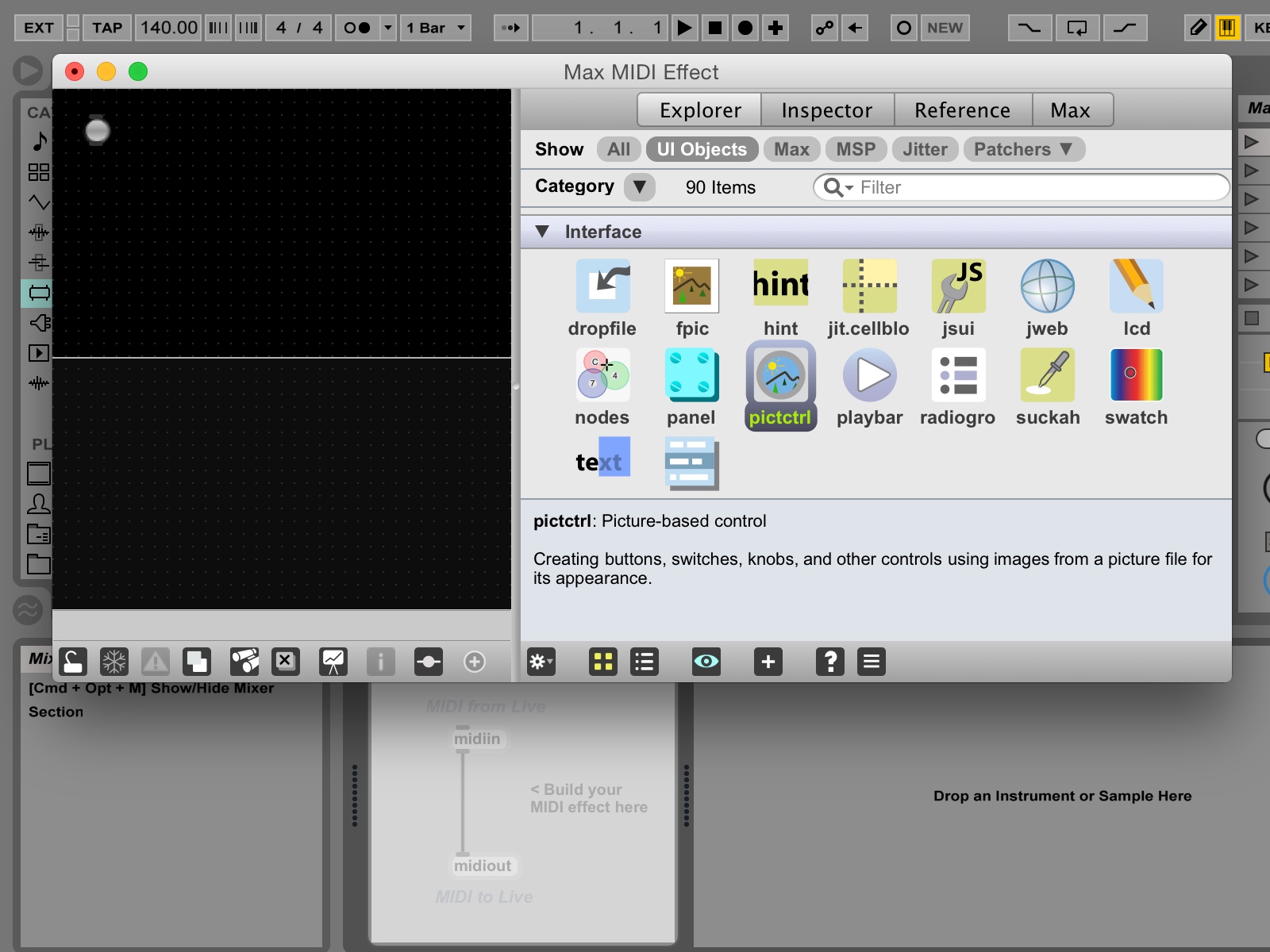
In the sidebar, select the Explorer tab and click the UI Objects filter. Scroll down the list of objects to the Buttons section and drag a
pictctrlobject onto the presentation area.
-
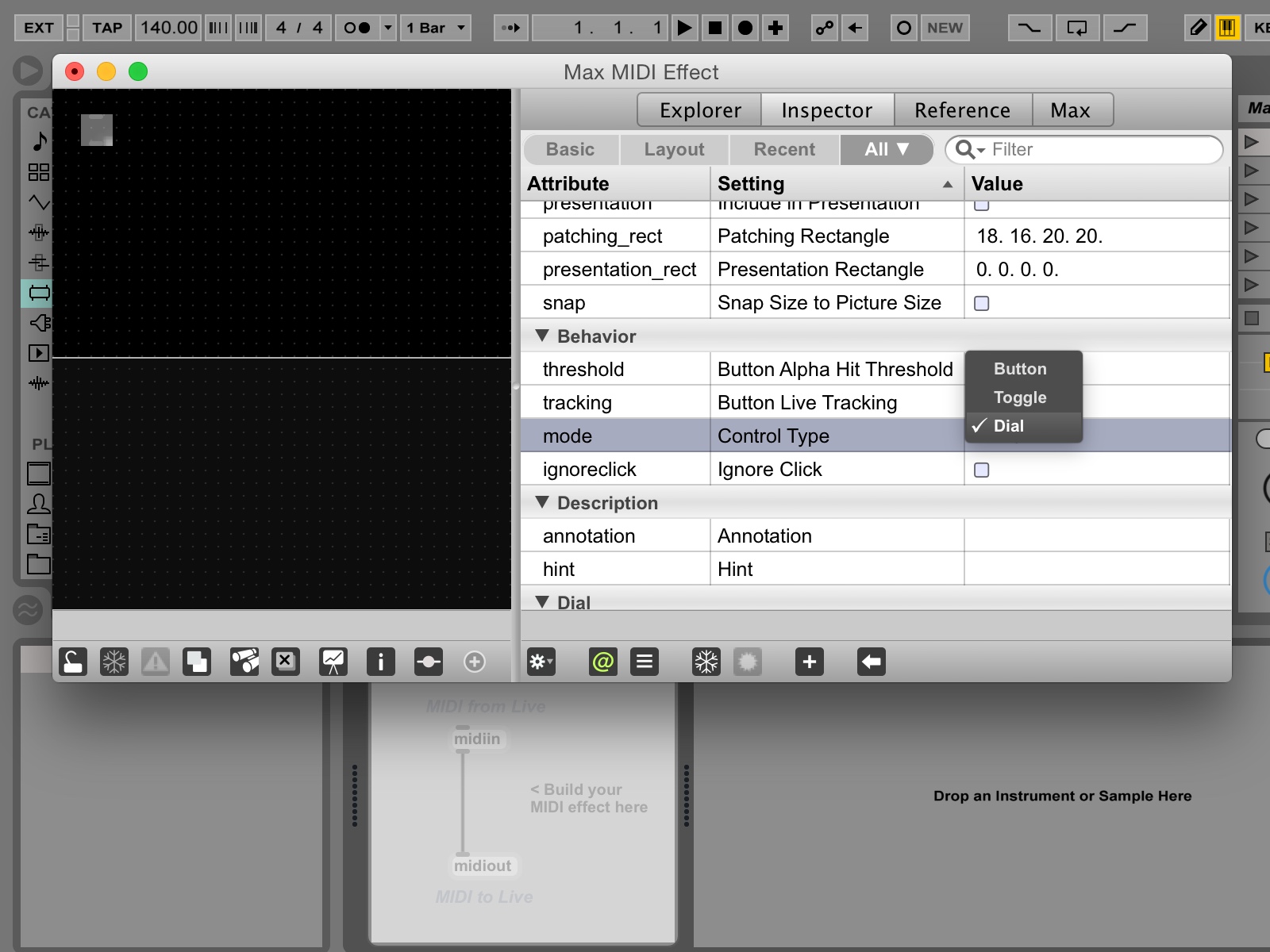
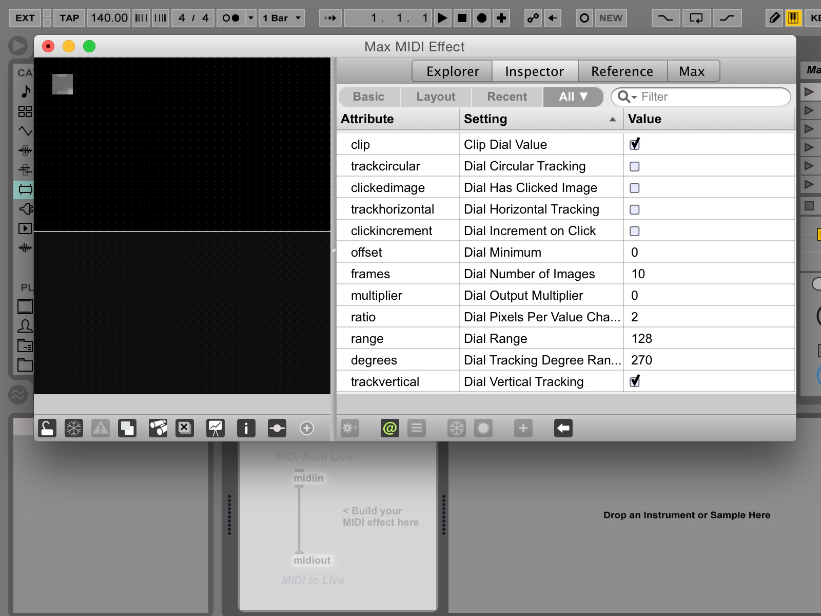
With the
pictctrlselected on the canvas, select the Inspector tab and locate the Behavior section of the Attributes. Change the control type from Button to Dial.
-
In the Dial section of the attributes, de–select the clickedimage option, adjust the frames parameter to match the number of frames in your dial image and click the trackvertical option.
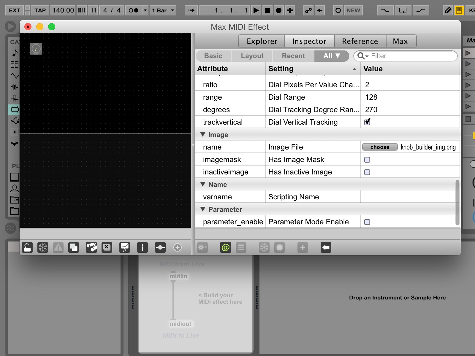
-
Scroll down the attributes list to the Image section. Click the Choose button and select your dial image.
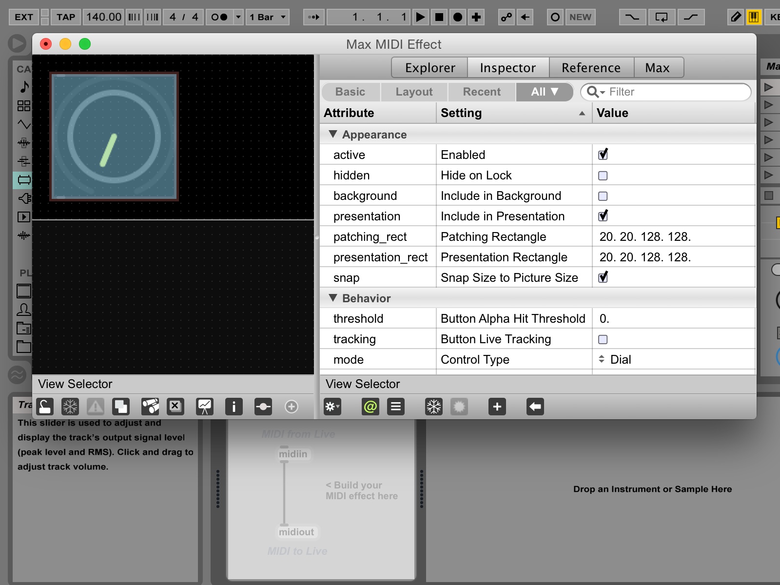
-
In the the Appearance section of the attributes, select the presentation and snap options.
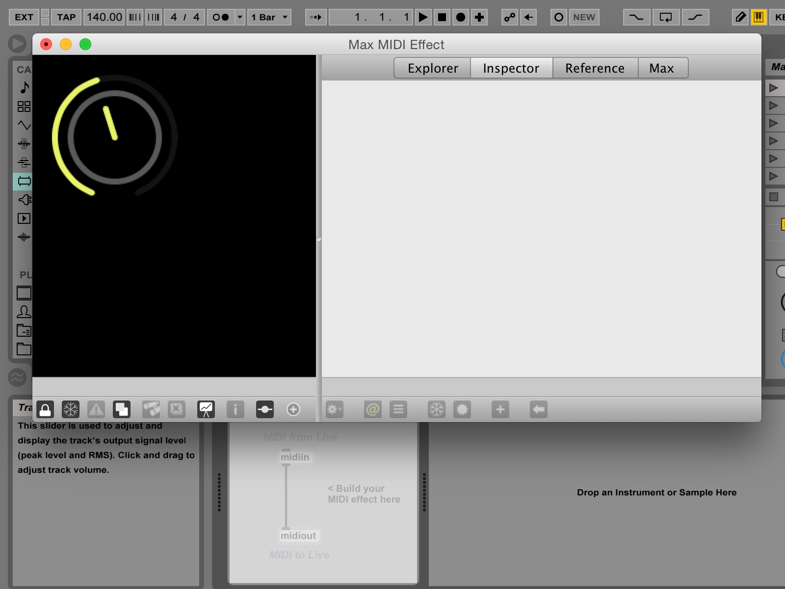
-
Click the lock icon in the patcher window and give your new dial control a try.
-
Save your Max for Live device to the same location as your dial image and close it. Try it out in Live. Nice job, take a break.
Downloads
Thoughts? Questions? Corrections? Send ’em my way: justin.rhoades@gmail.com